JLL TM Tracker
2022-2024
Simplify, simplify, simplify!
Company
JLL
Product
TM Tracker (Internal Tool)
Duration
1 Year - Platform Redesign
1 Year - Advanced Features
Team
2 Product Managers
1 Scrum Master
1 Designer
1 Engineering Lead
Team of Engineers
My Role
Design (Sole Designer)
Research
Product Strategy
Research
User Interview
Usability Testing
Surveys
Teams Chat & Poll
Design Workshops
Figma Prototype Comments
Overview
The Company
JLL (Jones Lang LaSalle) is a commercial real estate company that helps people buy, sell, lease, and manage commercial properties. It offers services like property management, investment and asset management, real estate development, and workplace strategy.
The Product
TM Tracker (Transaction Management Tracker) is an internal tool that helps JLL commercial real estate teams streamline the transaction process.
My Role
As the sole designer on the team, I was responsible for defining the user experience of the product, leading design from discovery to delivery. I conducted user research, led design workshops, and helped define the product roadmap.
Timeline
Part 1: Platform Redesign (2022-2023)
I redesigned the existing platform to improve usability, utility, and workflow efficiency.Part 2: Advanced Features (2023-2024)
I worked on introducing advanced features enabling portfolio strategy planning.
The Redesign
1. Overview
Background
Our product team was planning for a transition from Retool to React to improve platform performance. I saw it as a great opportunity to make the product better.
Problem: Poor & shaky UX foundation
The existing product had many usability issues that were hindering user experience and making it difficult to build upon. Some user flows and UI were confusing, time-consuming, and overly complicated. When you have a shaky foundation, it is ten times harder to build on top of it because you will also be fixing problems instead of actually building new things.
Solution: A redesign aimed to establish a solid foundation for UX
I proposed a complete overhaul by following the user-centered design process and adopting the latest design system. Getting us to a clean start, free of usability issues, would help save a lot of time from having to deal with unnecessary headaches down the road as the product grows.
My role
I advocated for the redesign by conducting user research, providing product vision, defining feature requirements, and providing design solutions.
Outcome
The redesign significantly improved usability, utility, flexibility, and efficiency, featuring a cleaner UI and a simplified workflow. Unfortunately, we didn’t get to implement the new design due to a shift in business priorities.
2. Research
Goal
I set out to answer the following questions to guide the redesign:
What’s working and what’s not working?
Who are our users?
How do we help TMs work more efficiently, effectively, and proactively?
Duration
2 weeks
Methods
User Interview
Goal: To understand user needs, goals, challenges, and how they work; Collect user feedback on areas for improvement.
8 existing users
1 hour/session
Usability Testing
Goal: To identify what’s working, what’s not working, and assess how severe the issues were
6 participants who have NOT used or heard of the product
30 minutes/session)
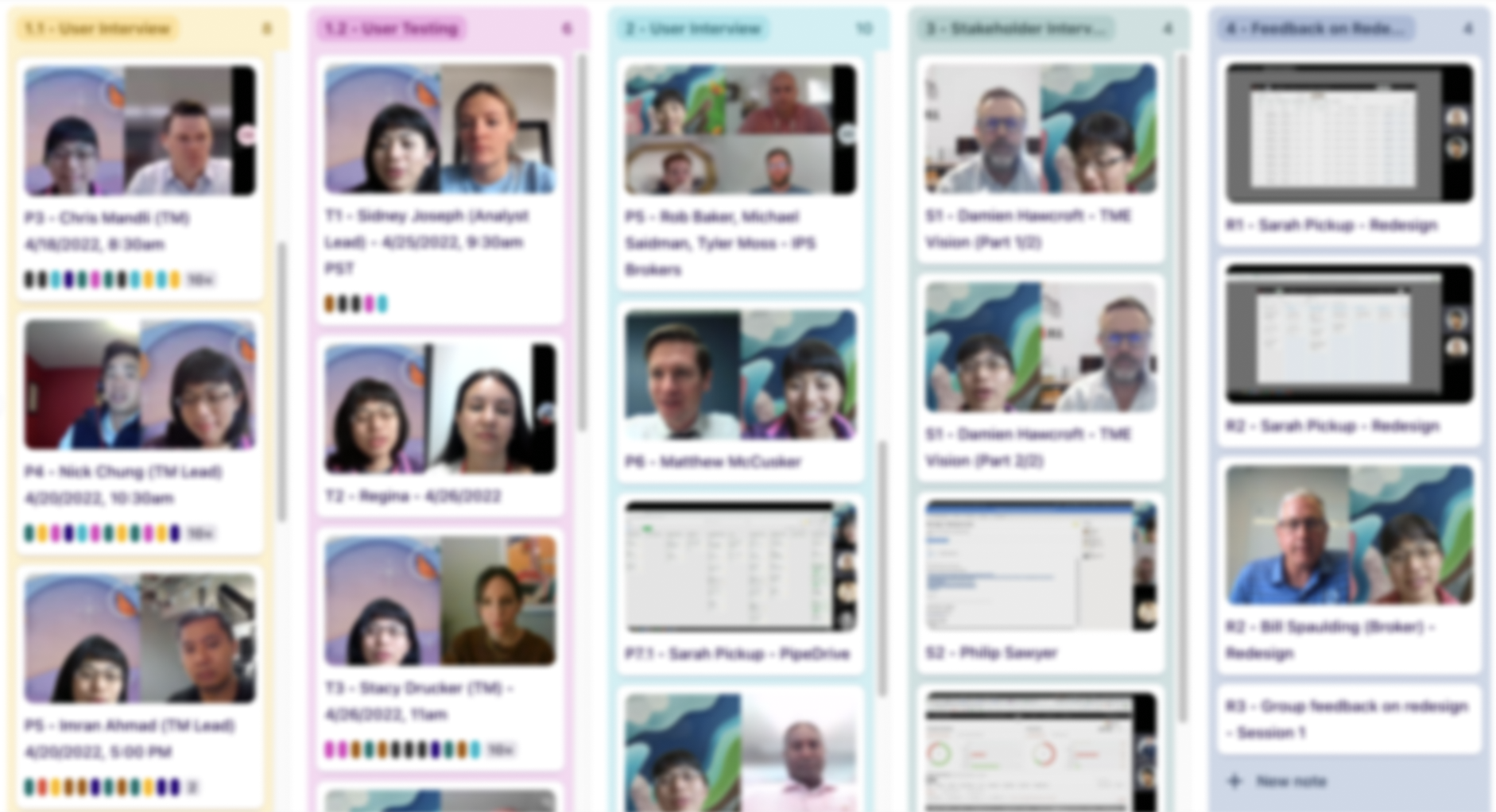
Data has been blurred out to protect privacy.
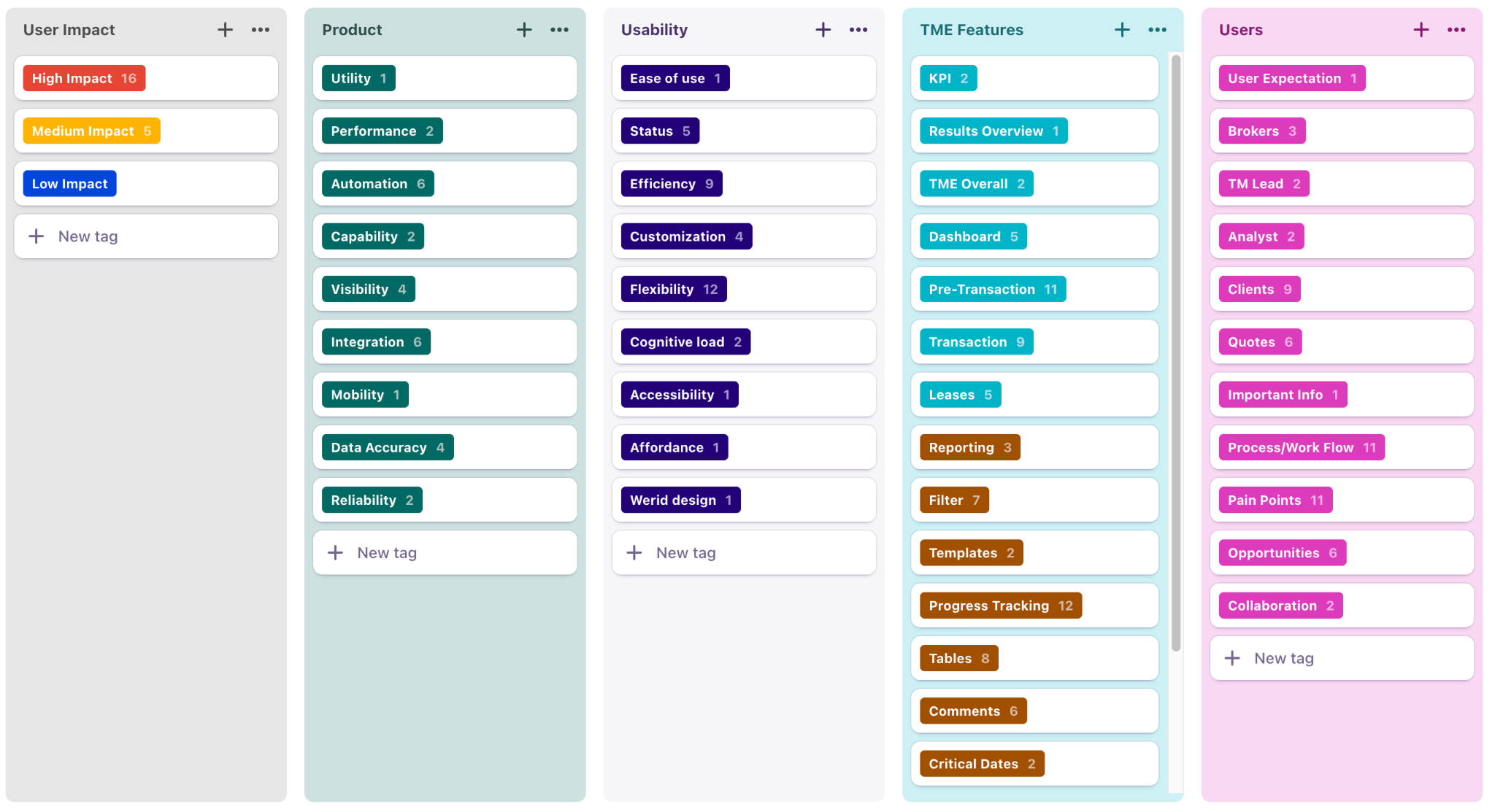
Research Analysis
I recorded each session and carefully analyzed it by tagging and grouping insights under different themes to identify patterns and connections.
3. Findings & Recommendations
Critical Issues
Efficiency: Users ended up spending more time instead of saving time with the tool, which completely contradicted the intention of the tool.
Reliability: The transaction status logic was flawed, which confused the users and clients.
Utility: Users wanted to see their comments directly from the transactions list view for the comments to be useful.
Usability: Users failed to discover functionalities due to poor design.
Flexibility: Users could not go back to previous steps in progress tracking, which failed to meet the needs of the dynamic nature of the business.
Client experience: Users were frustrated when their clients saw the ”delayed” label, which did not reflect the reality.
Performance: Slow loading speed was hurting adoption.
Data accuracy: Inaccurate data was hurting client trust.
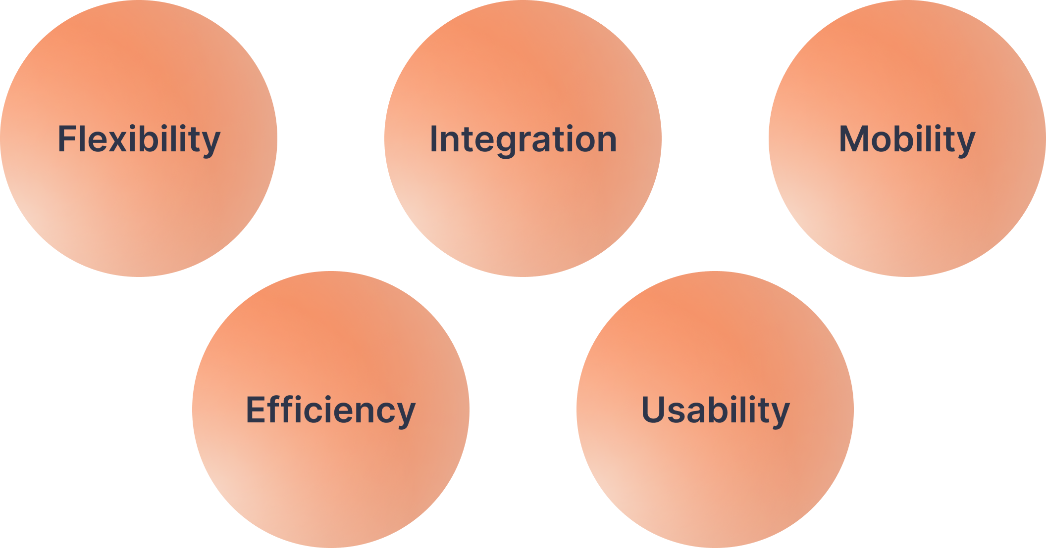
So, what do users really want?
If we want users to abandon their existing tools and processes and switch to new ones, we need to give them what they need. Our research revealed what mattered most to the users, which became the guiding principles for the redesign:
4. Product Strategy
With a clear direction for the redesign, the next question was: How do we get there? I proposed focusing on: How can we deliver value to users quickly?
These were the product strategies that guided the redesign effort:
Follow a user-centered design process: The existing platform was not built with this process, resulting in a series of issues that compounded over time. If we want different results, we must do things differently.
Invention over enhancement: Instead of fixing what’s wrong, focus on doing what’s right. Start asking: What experience do we want users to have?
Start simple: Simple → Complex
Enable, then optimize: Enable → Optimize
Users first: User needs → Business needs (See the “Lessons Learned” section for details)
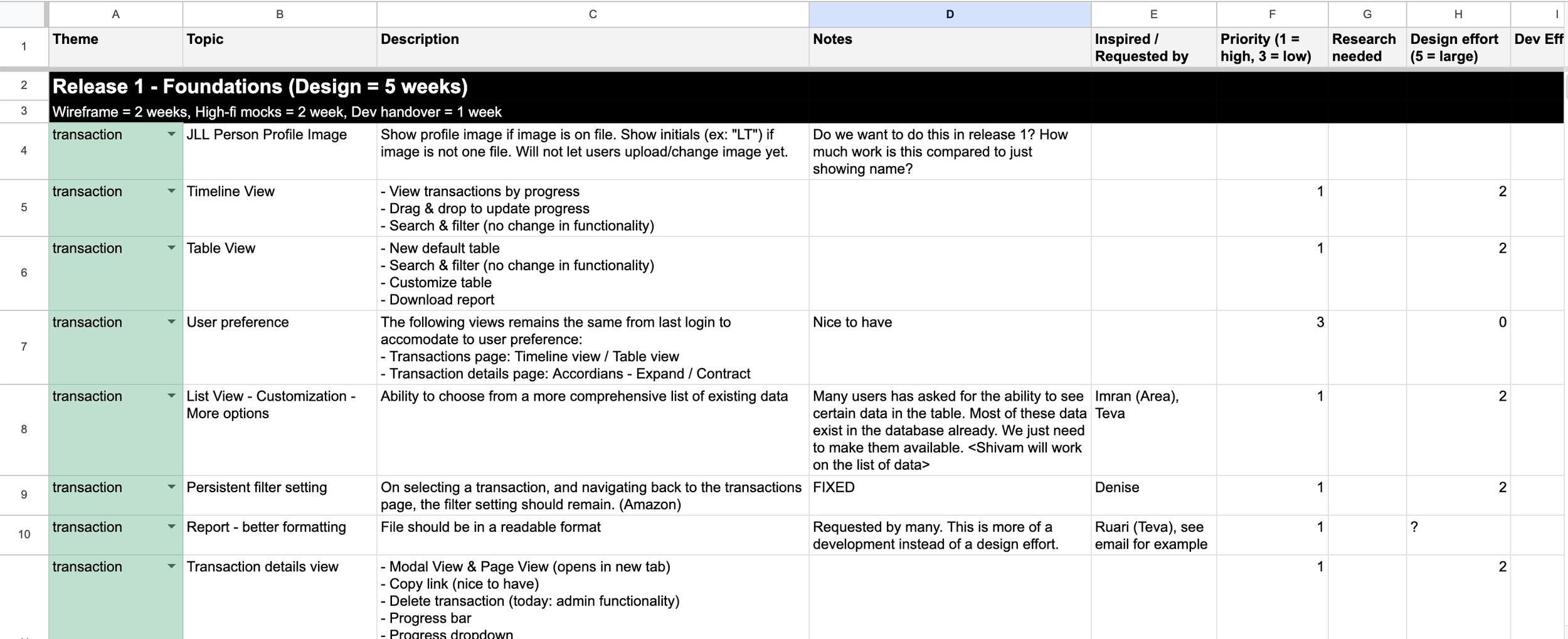
Building product backlog
The scale of the redesign was massive, which would require some time to complete the entire project. I broke down the project into user stories prioritized based on user and business impact, design contingency, effort, and complexity. I then proposed it to the product team.
5. Design Process
Iterative design
I repeated the cycle of design, test, learn, improve — over and over until it worked well. I made sure the team, stakeholders, and users were in the loop during the process to ensure the solutions would work and were feasible.
Design workshops
I facilitated regular design workshops with users and stakeholders from different regions to do a deep dive on the problem at hand, validate assumptions, and brainstorm potential solutions. We used sketches, mockups, and prototypes to guide discussions and collect constructive feedback.
I facilitated regular design workshops to gather insights and brainstorm potential design solutions.
The data has been blurred to protect privacy.
6. Outcome & Impact
We successfully improved the following areas with the redesign. Unfortunately, the development was canceled due to a shift in business priorities.
Utility - The tool now features data and capabilities that users wanted. (e.g, ability to see comments in the transaction list view)
Usability - The tool is much easier to use with fewer clicks, fewer back-and-forths, and a well-structured UI design that optimizes readability (e.g, new UI makes it easier to scan for data).
Flexibility - The tool is more flexible in accommodating the needs of different regions, clients, and teams.
Efficiency - Time on task has been greatly reduced.
Trust - We restored the trust of the users by fixing the status label logic that was misleading in the old design.
Example: We reduced 28 entry fields to 2 for the transaction creation step. A huge time saver!
While no one complained about this, I challenged the status quo. Users had to fill out over 28 fields just to initiate a transaction in the system, which users often delayed doing. In the redesign, we cut down the tedious “form” to just 2 essential fields, moving the rest to later. This dramatically sped up the process.
See the comparison for before vs. after:
Creating a new transaction - Before vs. After
New user flow
From creating to closing out a transaction
7. Lessons Learned
Bridging the gap through collaboration
Inviting stakeholders and users to the same table allows for questions, feedback, debate, and alignment. Stakeholders are able to hear user pain points directly. This closes the gap between the business and user — and makes buy-in much easier. When both sides feel heard, it’s easier to arrive at solutions that truly work for everyone.
When you can’t solve for both, start with users
We faced a conflict: The business wanted to collect transaction data through the platform. But the way the system was designed required heavy manual input from users, adding tons of work to their already full workload.
Because of the inefficiencies, some users abandoned the tool. Others entered fake data just to get through it. As one user put it: “If it doesn’t work for us, we won’t use it.”
The result? No adoption. Bad data. And business goals unmet.
I proposed a different approach: Start with users. First, focus on making the tool valuable and easy to use. Then, once we had traction, we could layer in data collection in ways that worked for the business and the user.
This isn’t about putting users above the business. It’s about decomposing a big problem into smaller problems and solving them in the right order.
As Google says, “Follow the users, and the rest will come.”